Lost Abbey is turning 20 this year!
It’s hard to believe that The Lost Abbey is going to celebrate our 20th Anniversary in 2026. With the new website coming online, I have decided to use the 52 weeks this year to go back in time and explore our artwork, our beers and our stories. So buckle up. Some of you might already know this. Others might have forgotten it. Or better yet, some of you might have wondered about these things for a long time but never spoke up. But rest assured, the labels and artwork have so many nuanced details it will be fun to share them in this space!
The Early Vision- When we agreed to launch The Lost Abbey and had secured the original brewing space (in San Marcos) we were a little behind schedule with regard to the branding and artistic impression for our bottles that I wanted to execute. We needed to create line art, we needed to develop an iconic logo and once these were completed, we still needed to pull all these things together to link them together and produce a branded panel of beers that could sit on the shelf together. This is a rough sketch of what needed to be accomplished in about 90 days time.
Step 1: Find an artist-
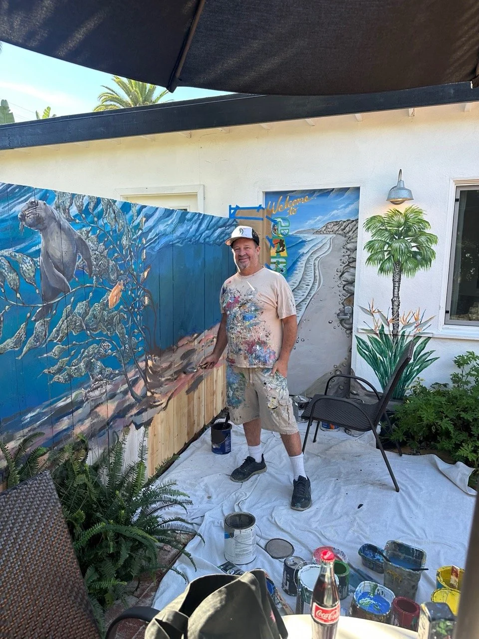
Sean Dominguez
Lost Abbey Artist
@artbydomo
Step 2: Give primary logo art direction-

Step 3: Revisions for logo and line art
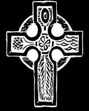
Original Celtic Cross, 2006
Step 4: Develop template for labels
Step 5: Give primary label art direction
Step 6: Write verbiage for back label and back story on the bottles (the what’s going on). Beer names and styles were already done.
Step 7: Print labels and cross fingers…
Finding our artist was actually a fortuitous bit of luck. Sean Dominguez had been working with Pizza Port on their art for a while and we spoke to him about our concept and making a run at things. A muralist/ artist by trade, Sean was very talented and excited about the opportunity to work on this project. We sat down and developed the thoughts on the Script, Logo and Line Art.
I was nervous about the first reveal and was looking forward to him bringing some great vibes. (Remember also tight deadline). Whelp that meeting didn’t go so well. The first round samples were a wee bit too ornate and had me feeling some low rider scripted/ flowyness (is that even a word)? Ultimately things got cleaned up to a point where I could really see the Line Art and The Lost Abbey font we have used for the past 20 years was set in motion. But the first few weeks were bit bumpy.
Next we turned our attention the logo. I had settled on the Celtic Cross as something I felt no one was using (more on that later) and I had a vision for how it would look. I wanted to integrate the four brewing ingredients and tie them together with our fifth element (passion for brewing) represented in the pagan moon (circle) which wraps around the cross. Water, yeast, hops and malt are each depicted on the logo in such a way they almost become like Celtic Knotwork. Thankfully the process of approving the Celtic Cross logo went faster and we were back on our scheduled way.
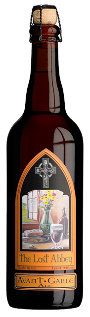
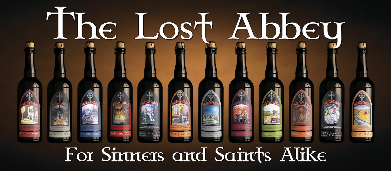
Avant Garde, Lost Abbey #1 Barcode 0001
The label template was a fun portion of the project. It was my desire to have a split label with a back label as well (3 parts). I had been drinking a bunch of Gary Farrel Pinot Noir and really come to love the way the split label on the front of their wine sat on the shelf. I really wanted to invoke a unique front panel that we could split, I summoned the stained glass filled church of my youth and found a shape set that really allowed the art to jump out, we had an area for the logo (cross) and lastly a place to define the naming convention and stylistic basis for what was in the bottle.
The best part of this process was being able to envision a “billboard” for our beers and carry over the look and feel of what a Lost Abbey beer would look like on the shelf. And given where we had landed it was obvious they would stand out. Knowing the biggest hurdle remained we got to work on the label art direction. I am not an artist and I draw crappy stick figures at best. So I knew I would not be the one drawing and painting. But what do have is a very active imagination and as such, I am able to close my eyes and lock in on a vision for our beers. What I didn’t know some 20 years ago was that Sean would be almost singularly the one providing the actual art for the labels. Over time the “look and feel” of a Lost Abbey beer has been defined by the images he has been commissioned to create.
The first label needed was for Avant Garde. This was to a be a Belgian/French Farmhouse styled beer. I met with Sean and discussed the vision being that of the classic loaf of bread cooling near an open window. While the baker was waiting they would need open bottle of wine (beer) and glass poured. All told it’s a simple and generic looking picture. It’s framed art you see at Bed Bath and Beyond for those who are looking to add some flair to their kitchen walls.
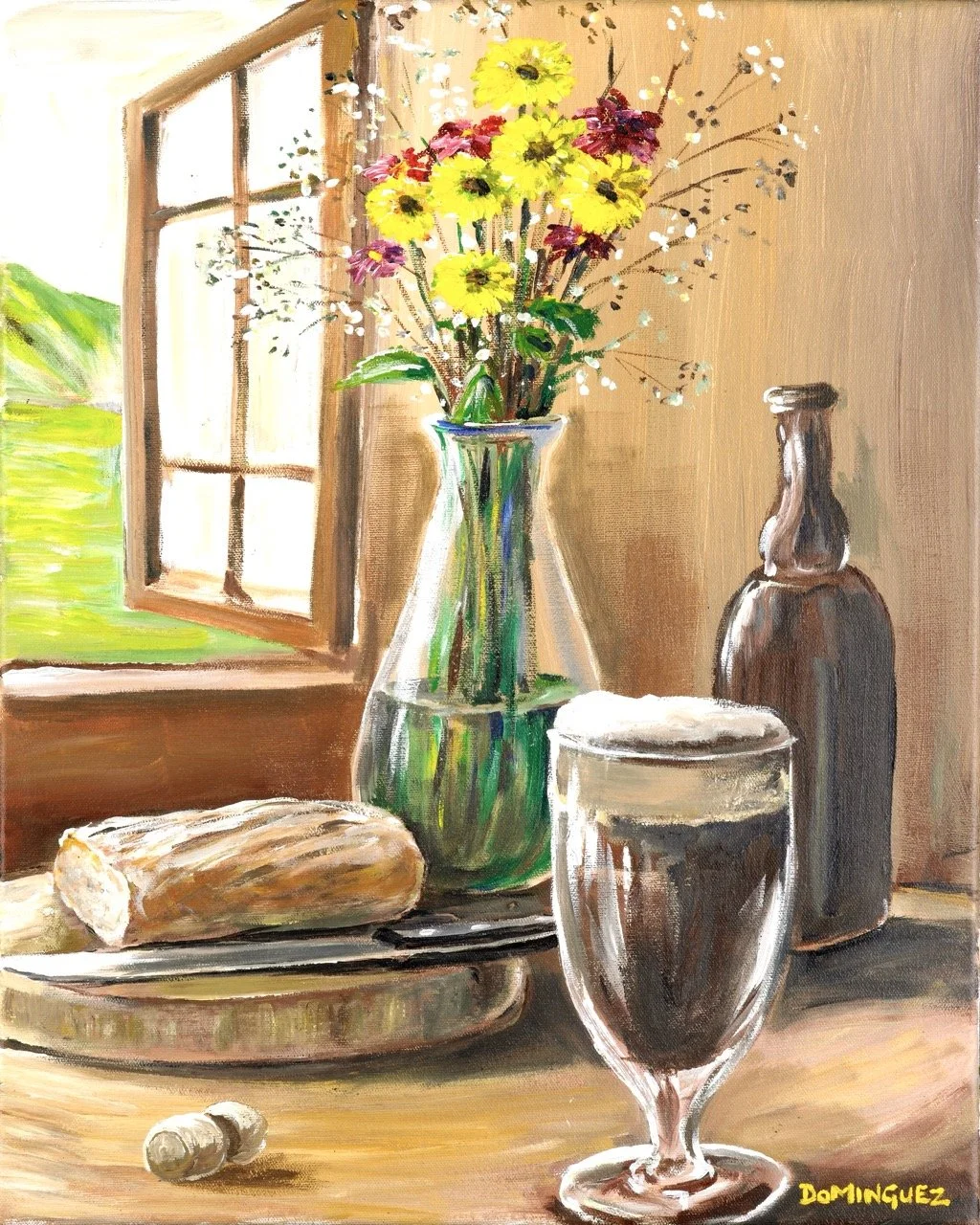
Original painting by Sean Dominguez
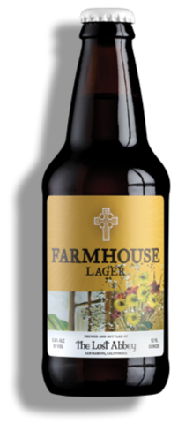
New small format bottle, same original art
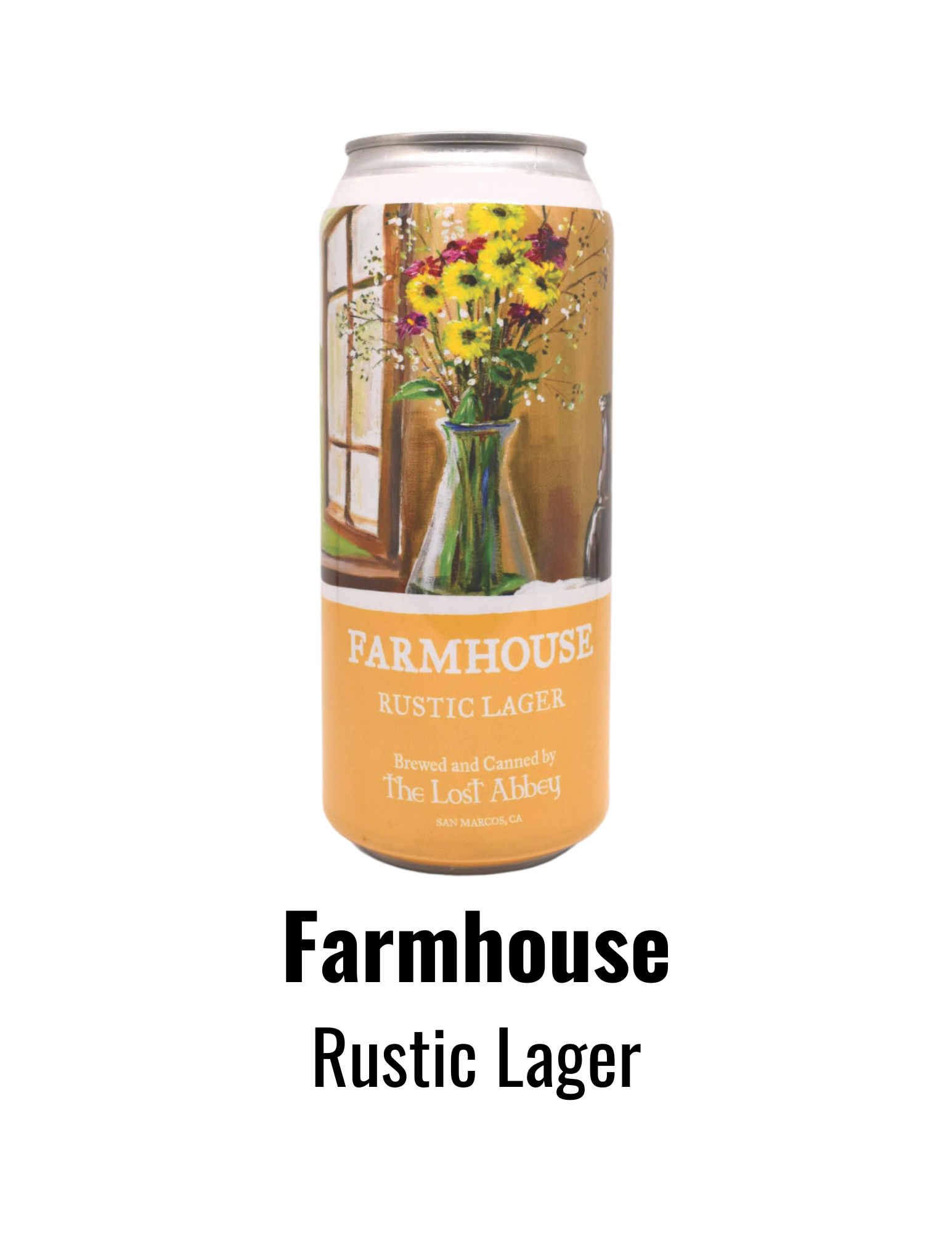
Current version, 16oz can
He set off and returned a few days later with a finished oil on canvas painting which immediately allayed any fears I previously had about using art to tell the story of our beers. It was brilliant. It expressed the need of the beer/ story and most importantly something I hadn’t even spoken to, it had a flower vase, over flowing with flowers and suddenly there was a touch of femininity in the painting that I hadn’t asked for as part of the art direction. In short, it just resonated with me that The Lost Abbey could really drive things forward with this artistic impression.
Fast Forward to Today: What’s even more amazing is that some years ago we rebranded the beer as Farmhouse Lager and the art remains with us (albeit in a canned form). But the very first and OG piece of Lost Abbey beer label artwork is still being used today. That seems fitting as we start our 20th year in business and is the reason Sean Dominguez has been an integral part of our story telling. Each week you can look forward (or not) to me posting about these unique Lost Abbey pieces. They are a rich part of our tapestry and the unique story telling defined by our DNA. I am excited to share the narratives, the behind the scene failures and ultimately explore how each label got the artwork of Sean Dominguez on the bottle. Buckle up I say.